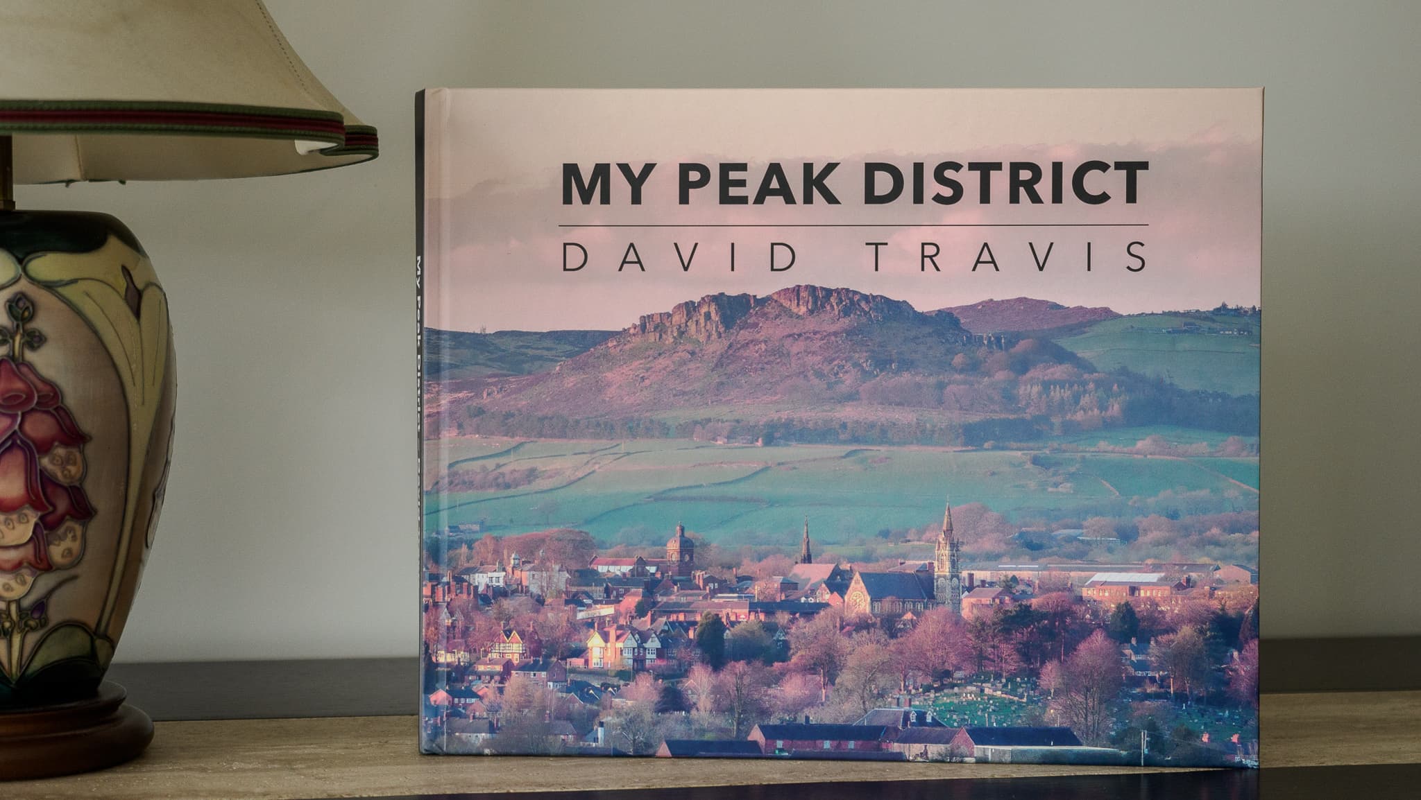
What I learned creating a large format photography book
For years I assumed making a photography book was mostly a production problem: pick the images, design the pages, send it to print. What I discovered is that a book isn’t just a container for photographs: it’s a test of whether the photographs belong together.
I’ll walk through the stages of creating my large format Peak District book, what surprised me, what failed, and what I’d do differently next time. If you’re sitting on years of photographs and wondering if they could become a book, this is the process I went through to find out.
Why make a book at all?
I have literally thousands of photographs on my hard disk. None of them will have any longevity unless I print them. I have a few prints on walls but I don’t have enough wall space to show a significant collection of images. This screenshot from Lightroom shows just a few handfuls.
I was drawn to the book format because it would give me control over sequence, pacing, and scale. But most importantly, a book is a thing: it’s the difference between scanning images on a screen and an object people can hold in their hands.
What I learned from a handmade prototype
I’ve created dozens of books in the past: some of them hand made, some of them printed by outlets like Photobox, Mixam and Blurb. The great benefit about a hand made book is that you have full control over the format and size of the book, the paper, and the print quality. The disadvantage of a hand made book is that it is difficult to scale to 100+ pages, and if you want more than one copy it becomes an inordinate amount of work.
I created a hand made version of a Peak District book a few years ago. This video shows that book, page by page.
But I wanted this book to be different. I wanted it to look and feel like a professionally published photography book with the option to produce multiple copies.
Making the book possible
I’ve used Mixam in the past to create some smaller books and I’ve been pleased with the cost/quality trade off. The picture shows a few of the books I've had printed by Mixam. In particular, the cost per copy drops dramatically once you start printing more than 20 or so copies.
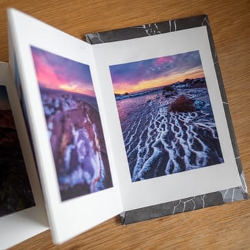
I wanted this book to be larger than others I’ve produced: 300mm x 240mm. This is more of a classic, ‘coffee table’ sized book and really gives the images room to breathe. It’s not one of Mixam’s standard sizes, but I could create it using their custom size option.
So Mixam could solve the production issue. I still had to solve the problem of creating and structuring the content.
Discovering the book’s structure
My Peak District photographs are spread across hundreds of folders on multiple hard disks. One reason I’d been putting this project off was that the selection process seemed so daunting. How do I decide what goes in and what gets excluded?
I created a collection in Lightroom that allowed me to combine images from the various folders, and I then created further collections that helped me think about how to organise them.
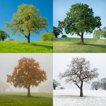
My first idea was to organise the photographs by season. That gave me four big buckets. But as I worked through this idea, I realised that my execution was shallow. I had simply found pictures I’d taken in each season, and then tried to shoehorn them into a ‘story’.
I then realised that the ‘four seasons’ idea was just one way to bring photographs from the Peak District together. There are many others, such as ’Climate change’, 'Weather and atmosphere’ and ‘Textural details’. So I decided to write down a list of topics that characterise each season in the Peak District. For example, for Summer, I had ‘heather’, ‘wildflowers’, ‘tourists’ and so on.
As I thought more about those topics, I realised that they could stand alone. So rather than organise the book by season, which is a bit clichéd anyway, I could organise it by themes. This would give the book a stronger sense of authorship and allow me to showcase the diversity of photographs I’ve taken in the Peak District.
Why small prints beat screen viewing
I reviewed some of the photography books in my collection. I noticed they tended to have 100-150 images, so that was what I decided to aim for. In my initial set, I had ten themes and around 15–60 images per theme. This gave me breathing room, but it also forced me to curate. The key now was to define what each theme was really about so I could judge which images served the book, and which were just good standalone shots
It was too difficult a task to organise this number of images on screen so I used a cheap print service (Snapfish) to create 6 x 4 prints. That allowed me to spread the images on the floor. I could then find images that paired well and identify images that deserved to be printed on their own. It also allowed me to reject images that worked only as standalone pictures and that didn’t serve the collection.
With a working sequence in hand, the challenge shifted from selection to presentation.
Stealing layout ideas from photography books
Because of my previous career in user experience, I have a sense of what makes ‘good’ and ‘poor’ visual design, but I would never call myself a graphic designer. So for the overall design of the book, I turned to the photography books in my collection. I chose one that had the combination of text and images that I liked and used that as the style guide I would follow.
This was enormously helpful. When I had a specific question about the design, I could see how the designer of that book had solved the issue. For example, when I was laying out a full bleed image I didn’t know where to put the accompanying caption: I just knew that I didn’t want it to overlay the image. So I looked at what the other designer had done and copied that approach. My design wasn’t a wholesale smash and grab: I still made several changes to the layout (mainly so I could align components to an underlying grid).
I laid out the book using Affinity Publisher. This is a fully-featured desktop publishing program and fairly easy to use (and it’s recently been made free). My two pieces of advice to someone using it for the first time is to, first, commit to a specific page size before you start. If you change your mind when you are halfway through you will need to re-think your page layouts too. And second, create a set of master templates for the various page layouts you will use. This makes it easy to achieve consistency throughout the design.
But it was when the pages existed that weaknesses in the structure became visible.
The reality check: Where it started to go wrong
For most of the themes, I was in the fortunate position of having more strong images than I could include in the book. This allowed me to be choosy about the images that made it in. But I had a couple of themes where I was short of strong images.
I didn’t notice this when I was working with the 6 x 4 prints, but it became very apparent when I was laying out the pages in Affinity Publisher. For example, I had a theme provisionally titled ‘Details’ that showed textures and close-up features of the Peak District landscape. But these images didn’t gel as their own section. I decided it was better to chose the strongest of these images and place them in the other themes.
As another example, I had a theme titled ‘Peak District Towns & Villages’. My idea was to feature towns like Bakewell, Hathersage and Ashbourne alongside smaller villages like Tideswell, Litton and Butterton. But I just didn’t have the content. I realised that when I visit these locations, it’s usually on my way to explore a rural landscape. I never really spend long enough in the town or village to capture the sense of place needed for a strong and varied section. So I decided to scrap this section of the book entirely. This was useful as it has now spawned a new project: I now recognise that ‘Peak District Towns & Villages’ deserves its own book.
Seeing the book as a finished object
When the book arrived, I was really pleased with it. On screen, the work always felt provisional; but in book form it was finally settled.
I also noticed something unexpected when showing it to people. Instead of flicking quickly through the pages, they slowed down. They read the captions. They went back to earlier pictures to check something they’d noticed. The book made them treat the photographs more… respectfully, especially when compared to screen-based viewing.
There were also some imperfections. When I compared my book side by side with a top quality book (the same one that I copied the design from) I could see the binding in mine wasn’t quite as perfect. But once the book was open, it was very difficult to detect any differences between the two. The quality of the photographs was excellent.
What I learned (and what I’d do again)
Creating this book was something I’ve been working on for years so I wanted to make a good job of it. Here’s what I learned:
- A book is a decision-making machine: You can keep building your digital archive indefinitely. But a book forces you to curate. That constraint reveals your photographic voice.
- Structure determines meaning: How images are paired and grouped changes how they are interpreted. Choosing themes (as opposed to a generic topic like the four seasons) turned the book from a cliché into a personal statement.
- Editing is easier with physical prints: Arranging small prints on the floor revealed relationships that I couldn’t see on screen. The act of moving prints by hand allowed me to try out different sequences faster than any software.
- Not every idea belongs in the same book: Scrapping the towns and villages section improved the book and clarified my next project
- A book changes how people view images: Viewers read captions, take time with the images, and treat the book with consideration. The book encouraged viewers to slow down in a way that screen viewing rarely does
Those lessons raise a practical question: what happens to the book now?
A note on availability
Holding the finished book made something clear to me: the real value of the project wasn’t just the book itself, but the decisions it forced along the way. The book clarified what my Peak District images are actually about, what they aren’t about, and what might come next. It also showed me that a collection of photographs doesn’t need to be definitive to be worth publishing. It just needs to represent a moment where the work has something coherent to say.
This edition feels like that moment. Because I produced the book through Mixam, I have the option to print further copies if there’s enough interest. Printing only one or two copies makes each book expensive (over £90), but a larger run brings the unit cost down to something more reasonable (£20).
So rather than treat this as a commercial launch, I’m treating it as a test of whether the book should exist beyond my own shelves. If you think you might like a copy, just click this link and send me an email . There’s no commitment. It simply helps me decide whether a small print run makes sense. If I get enough interest, I’ll contact you to see if you still want a copy.